CASE STUDY 4: HOW TO MOTIVATE SUSTAINABLE CHANGE
UX/UI Research Passion Project: the habbbit app that makes data evaluation a fun ‘addiction’
business strategy  user interviews / stories / tests / flows affinity maps gamification illustration / animation UI design data viz UX writing design system style guide low / mid / high-fidelity prototypes
> where
Cologne
> when
feb – sep 2022
> what
passion project of choice at CareerFoundry
> my role(s)
everything except from the final software implementation
> customer needs
– empowering behavioral changes for a healthier lifestyle
– fun and motivation to keep on going
– easy data comprehension
– understanding which actions have the biggest impact/results
background story
User experience in reality is a bit of a messy process, depending on many factors (from business goals, budget, or time restrictions to the availability of test participants). Often this means ‘guerilla testing’ and a sequence of events that don’t fit neatly in a case study.
In 2022, I took a ‘sabbatical’ to study some topics I wanted to explore on a deeper level and without a lot of client restrictions: mobile first/app design, motivation, gamification, and data visualization.
I ended up doing an in-service training project for about 8 months, developing an app, habbbit, from A-Z. I could spend all the time I wanted doing user interviews and tests, creating personas, user flows, and all the cool stuff UX provides as tools. In real life, most product or service development projects have to take shortcuts here due to budget and time constrictions.
 Since an 8 months journey is way too much to show every single step, I’d love to go into detail in person – answering your questions about any of my projects and how I might help you with yours.

project overview and tasks
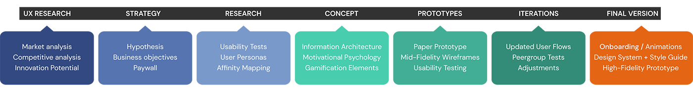
the challenge
Creating an outstanding app in the highly competitive health care market (with „health“, Apple’s pre-installed competitive app on any iPhone) that helps users make better and more empowered lifestyle choices – and stick to them.
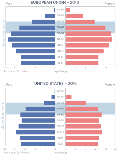
market analysis and target group
Born in the 1950s and 60s, the Baby Boomer generation means a huge change in population geography with a predictable and drastic social and economic impact within a few years. By 2030, those aged 65 and older will make up over 20% of the US population (this differs worldwide, with f. e. Germany and Japan ranking higher, and some African countries on the bottom of the scale).
While the Baby Boomers are right now holding 70% of the disposable income in the U.S. (spending over $548 billion a year), their health care costs will explode within the foreseeable future. A platform or application as an effective tool for managing health and wellbeing would have huge benefits, both on a personal level as well as for the healthcare and social system.
Of course, there are competitive apps (but Apple’s free health app gets only a 3-star rating in the Apple Store). But the products I tested (e.g. Mindshine, Calm, Headspace, Cardiio, Heart Analyzer) were aimed at a pretty narrow functional area and often lacked motivational and educational features. User tests would show what performance characteristics could make a new app distinctive and attractive.
hypothesis
We believe that by creating an application/platform to empower Baby Boomers (and other users) to collect, store and evaluate health-related data we will achieve to enable them to gain more self-responsibility and empowerment that helps them with making better and more conscious choices for a healthier lifestyle and long-lasting high quality of life.
business objectives, information architecture & paywall
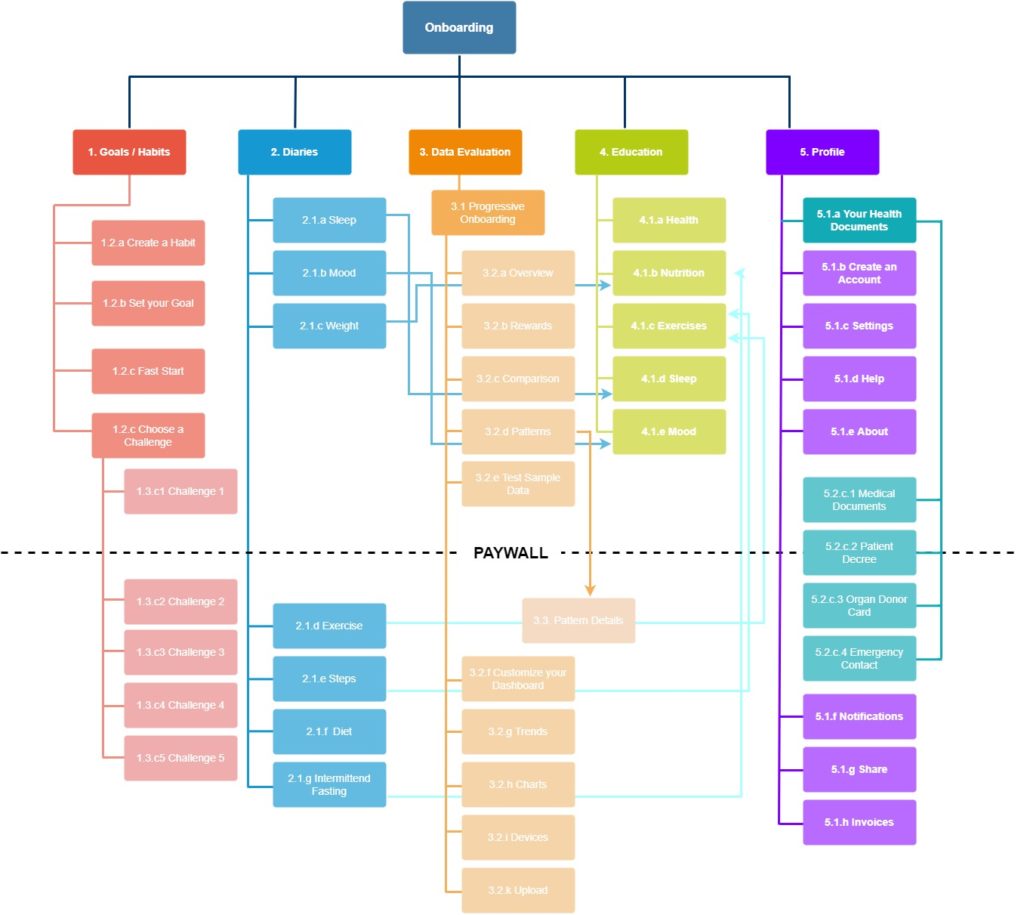
I came up with a first raw concept of high-level topics. Although the depth of the structure points out to a desktop-based platform, nevertheless I tried from the beginning to constrict the Information Architecture to max 5 topics that could fit into an app menu.
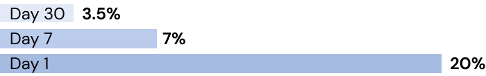
According to studies, only 25% of users revisit an app the day after download. For medical apps, the numbers are even lower.
Retention rate on day 1 and day 30 of mobile app installs worldwide, 2020:
(source: Statista)
Eventually, the business goal of making the user a paying subscriber had to be met, but I’m a big believer in delivering value before asking for money (or personal data). So, the first-time users must be able to experience a lot of what makes the app enjoyable before being faced by a paywall.
I created the first draft of Information Architecture, considering different ways to include a paywall (f. e. for notifications or deeper levels / more days display or data exploration).
user interviews and a major strategic switch
So far, I had done some market and competitive research, formulated a hypothesis and wrote a business requirement document. Time to do some UX magic – getting the hand on the hard facts – the real-life user’s point of view.
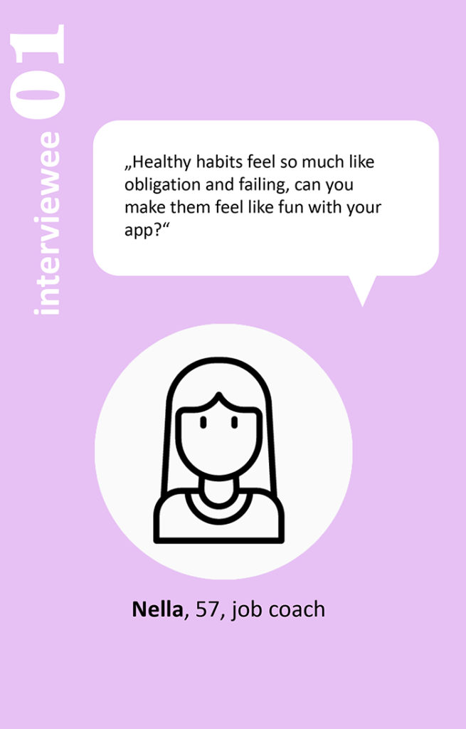
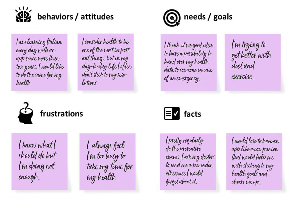
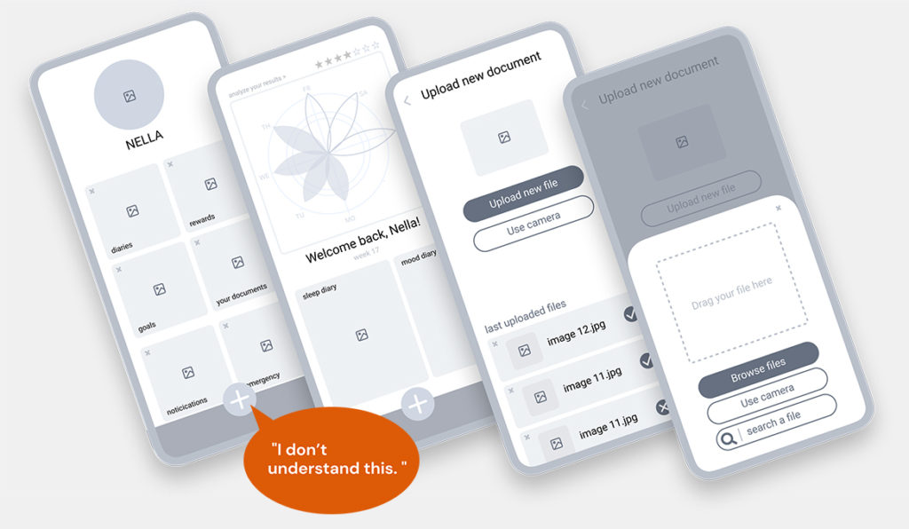
I conducted user tests with 6 participants, 4 from my target group (Baby Boomers) and 2 a bit younger (to see if there was a difference in case we would want to expand our audience later on). Here is one example: Nella.
decision
 In a nutshell: the original idea of making uploading important health documents (like a living will or lab results) totally bombed. 2 out of 6 participants even stated that an upload function in an app with sensible health data would make them abandon the app immediately.
But on the positive side – there was a lot of unanimous (6 out of 6 participants) enthusiasm for the idea to be able to collect and compare data to better understand interdependencies of health-related data and achieve (better and faster) results with the lifestyle changes. So I skipped the initial idea for the project (focused on baby boomers and document upload) and formulated a new hypothesis.
Note: In real life, there would have been lots of discussions with the stakeholders. Running a passion project, I was able to follow the very clear path the users had laid out in the interviews.
hypothesis 2
We believe that by creating an app that makes collecting, tracking and comparing health data and actions and easy for all age groups, we will achieve empowerment, motivation and support for healthier lifestyle choices that helps them with getting better results, stay motivated and stick to their goals long-term.
user personas and mental models
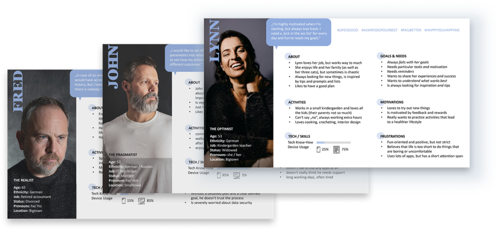
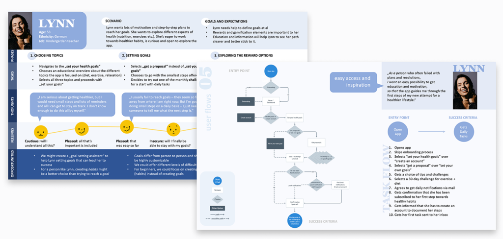
Based on the data I collected and evaluated during the interviews, I created three personas that represented three different personalities, needs, goals – and three ways to approach and use the app. Lynn stands for a more fun course of action and interest in „playing with the data“. John for a more rational or scientific approach to interpreting results, and Fred represents a user group that might start with the upload function of health data (the original idea) and would have a look at whether the data part could be something of interest.
user journeys and user flows
All three personas understand and need motivation in a completely different way, they might use different approaches to navigate the app. I created user journeys to show their feelings, thoughts, and actions while they aim to find motivation within the app. After mapping this out, I defined user flows for all three user personas and their individual „happy paths“ to their goals.
card sorting and a radical concept / structure change
The plan to provide different paths to different goals made me do some more user research. I wanted to determine how and where users would look for actions and motivation. This would influence how they would match different topics to the predefined categories of my Information Architecture. I conducted an „open“ card sorting study with 9 participants – letting them assign different topics to raw categories. This usually delivers more complex or chaotic data than constricting the assignment possibilities but delivers more insights into the user’s expectations.
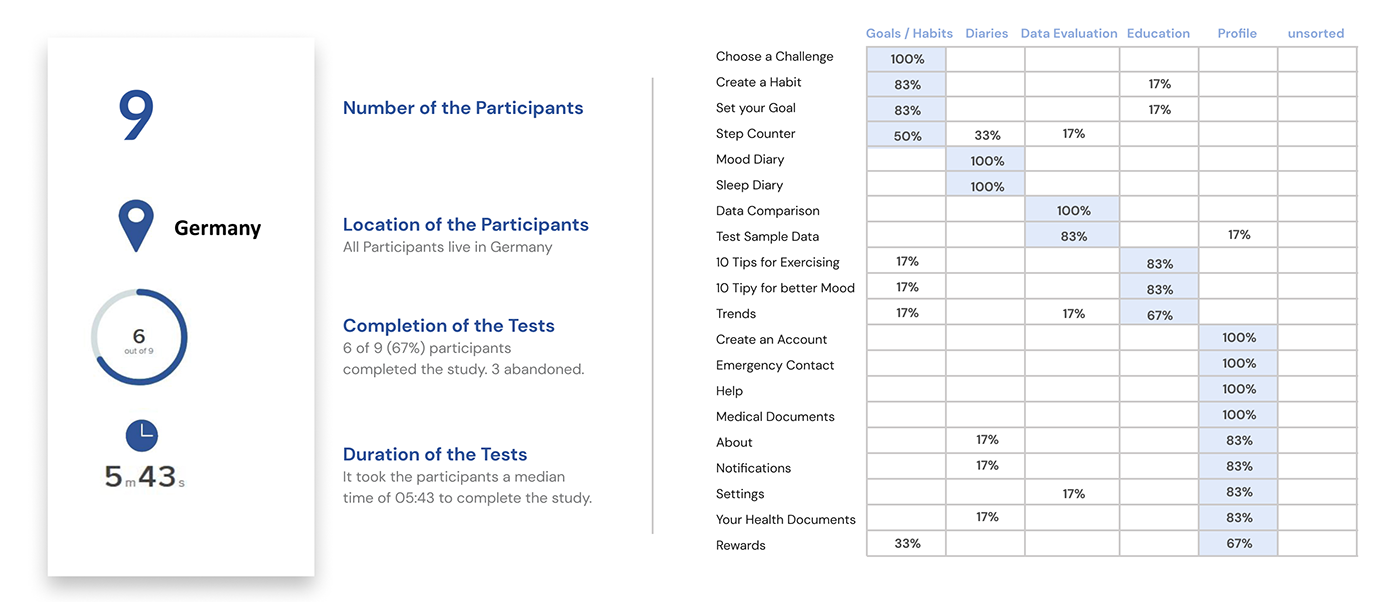
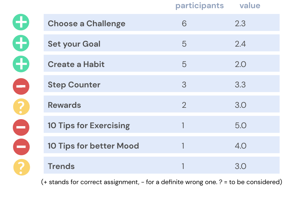
Most cards were sorted correctly, f. e. placing „settings“ in the „profile“ category. But the evaluation also showed huge discrepancies in some areas. It took me a bit to understand that the study results showed more of a psychological than a structural problem, especially as soon as it concerned goals.
From a psychological perspective, the users expected results (in terms of rewards and trends) to be in immediate proximity to their actions.
This made me rethink my complete Information Architecture, motivation approach, and wording. F. e., so far I had considered „evaluation“ to be one of the main categories, but now renamed it (slightly incorrect from a scientific perspective) to „results“. Plus, I understood that „rewards“ would have to be a main part of the app and needed to be prominently featured in the menu and everywhere where the action happens.
habits vs goals and naming the app
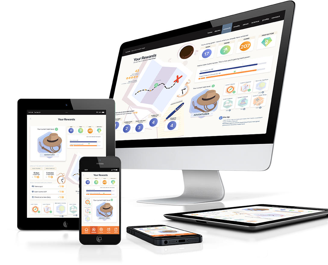
The rewards‘ topic is closely related to how we approach change – feeling rewarded increases retention. Most people fail in reaching their goals (4 out of 6 user interviewees, as well most New Year’s resolutions). Habits are the secret to reaching any goal, quasi incidentally. Why? Daily habits deliver a small win (reward) every day that keeps us going. After the second evaluation of my previous research (the card sorting results, user personas and user flows), I made the decision to create an app around habits – habbbitt. Later in the process, I created (and created, illustrated and animated) an onboarding video for desktop devices to explain the principle and advantages of habits vs goals and how to become a ‘Habit Ninja’. Small sections from the video are displayed during the onboarding process of the mobile version.
(Click to watch the video)
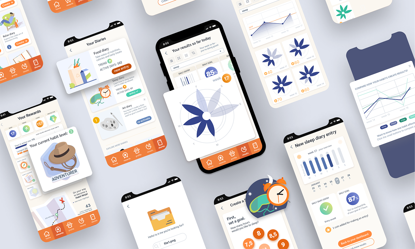
the foundation: low-fidelity wireframes and mid-fidelity functionality tests
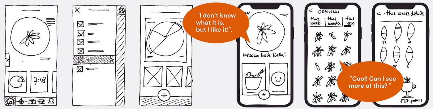
With the new structure and the motivational part in mind, I started building the app by sketching and refining the first screens on paper to a create a clickable prototype for further user tests. The paper prototype enabled me to make a quick user test about the main feature I had in mind: a playful and unusual way to display the collected data: as flower charts, with each leaf representing a day. Even without knowing exactly what the charts represented, the users liked the visual approach and wanted to learn more.
Having a confirmation for the data part, with the mid-fidelity wireframes tests I focused on the functionality and user navigation.
I tried to introduce different forms of a single „floating“ menu button to reduce visual overload in the screens with data display. But mental models won over design: the (iPhone) users were irritated or it took them too long to navigate from A to B. So I decided to go with a classical menu bar for the high-fidelity prototype.
Three rounds of wireframes (and user tests) helped me to polish the structural aspects and find happy paths for the user navigation. Now it was time to focus on the point that I had deliberately left out in the mid-fidelity wireframes: the way I wanted to visualize the core function of habbbit: data.
data visualization approaches and logo
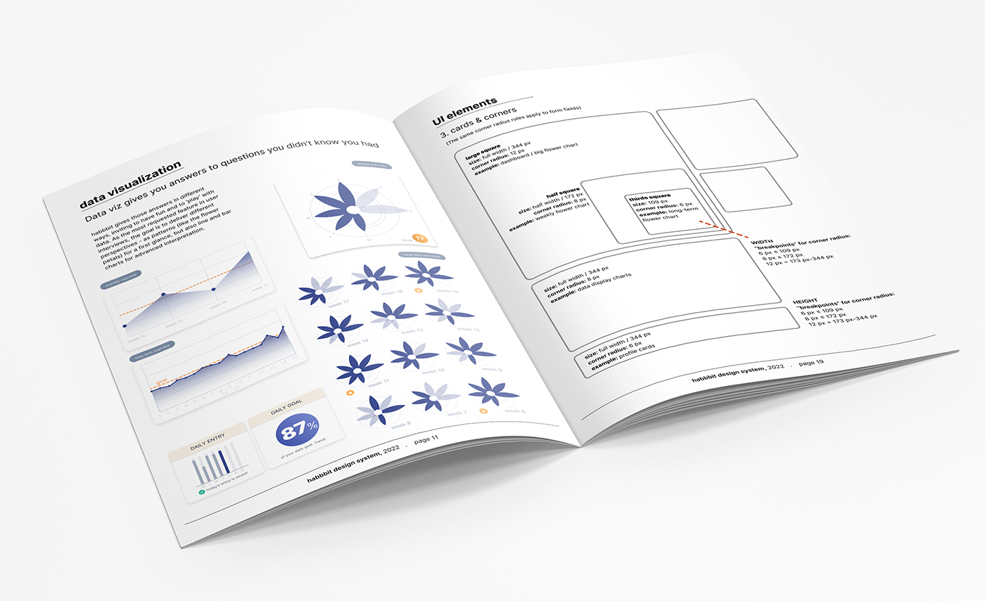
Data Visualization means making complex data visible at a glance. With a constant decline of the human attention span, compressing content will become more and more important for any form of content design in the next years. Making content „skimmable“ (breaking up long-form content in a way that allows readers to quickly scan its main points) will be one of the next big things. Data visualization is a possible (and elegant) way to communicate condensed information fast and easy to the users.
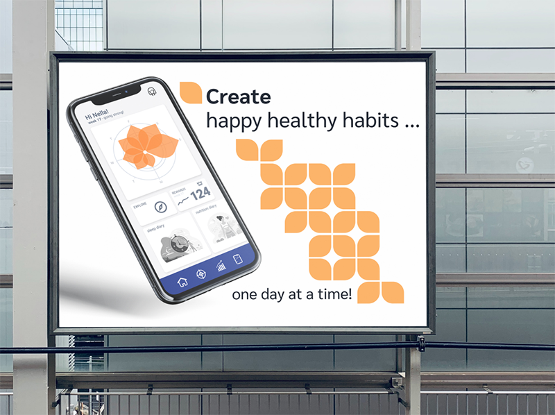
Since habbbit was a passion project, I took my time to explore an ambitious approach: could I combine my data visualization with the (literally) very big picture by creating a „flexible design system“, that combines a basic form to patterns of all sizes? That is: from bits of data viz to UI design elements and large-scale mediums such as an outdoor poster display?
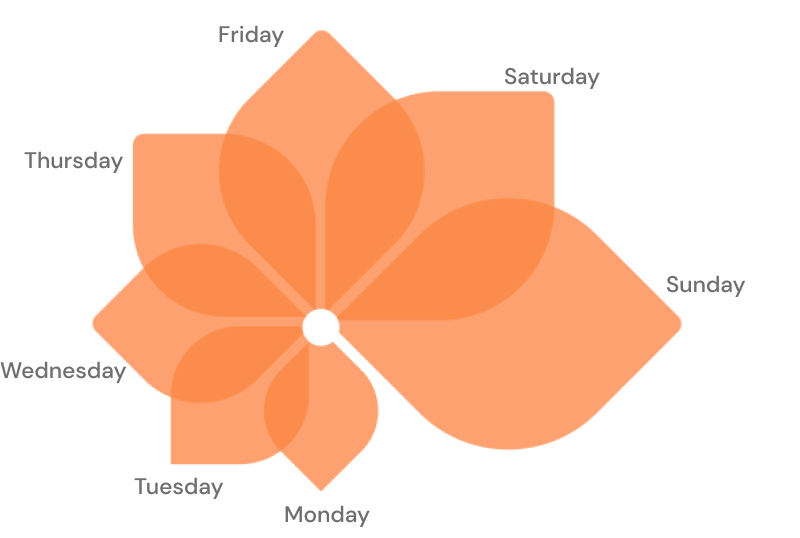
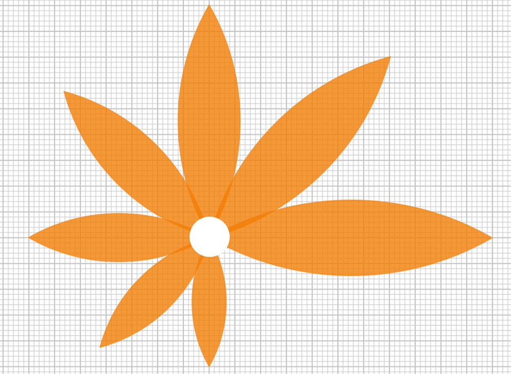
To make things short: I failed. A flexible design system needs bolder, chunkier forms. After testing lots of possibilities, I returned to the original idea of my flower chart (a leaf per day, a flower chart per week). I came up with incrementally bigger leaves to visualize growth and dynamics – thus visually (and unconsciously) taking up with the user’s wish for progress and fast results.
Finally, I designed a logo for habbbit – „stacking“ the leaves to visualize the daily progress (there’s even a psychological term „habit stacking“ as a habit building technique) and rotating them for associating dynamics. The visual reference to stacked stones – a meditation exercise – is not coincidental and refers to the relaxed approach of habits vs goals.
color palettes and A/B testing
habbbit has two focal points: motivation and data viz, and both had to be considered when working on a color palette. From classical color psychology’s perspective, motivation is usually associated with bright orange. I tested lots of color shades to come up with the brightest orange that was still accessible/readable with white font, together making the UI elements look bright and powerful. As the second color, I chose a complementary contrast with a reddish blue. For one part, complementary contrasts make UI design look fresh, modern, and uplifting, while blue stands for seriousness and trustworthiness – perfect for data display.
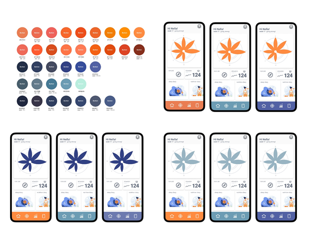
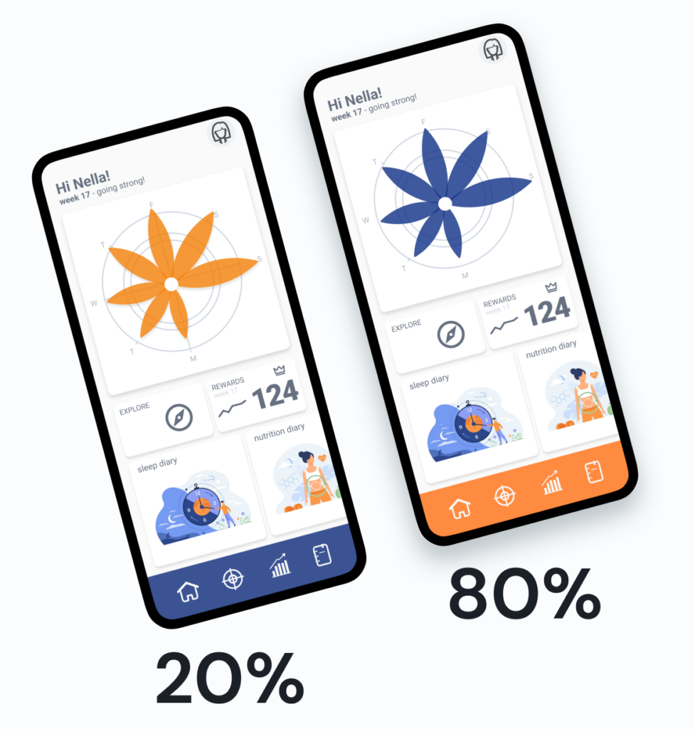
In the final A/B test with 10 test persons, 8 out of 10 participants decided for the blue flower and orange navigation. Again, I went with the user test results, despite the fact that I originally had orange flower charts in mind. But besides of the user’s voice, the color assignment makes sense: orange for navigation (or buttons / CTAs) means using the motivational color for all things action and blue for data, that is elements of reliability
new information architecture and more usability tests
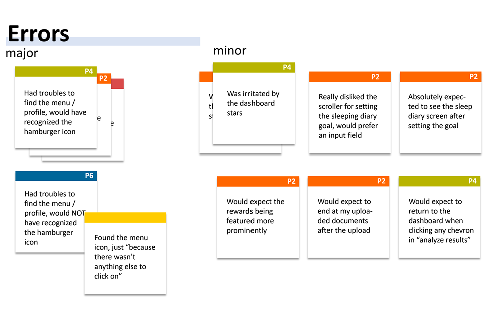
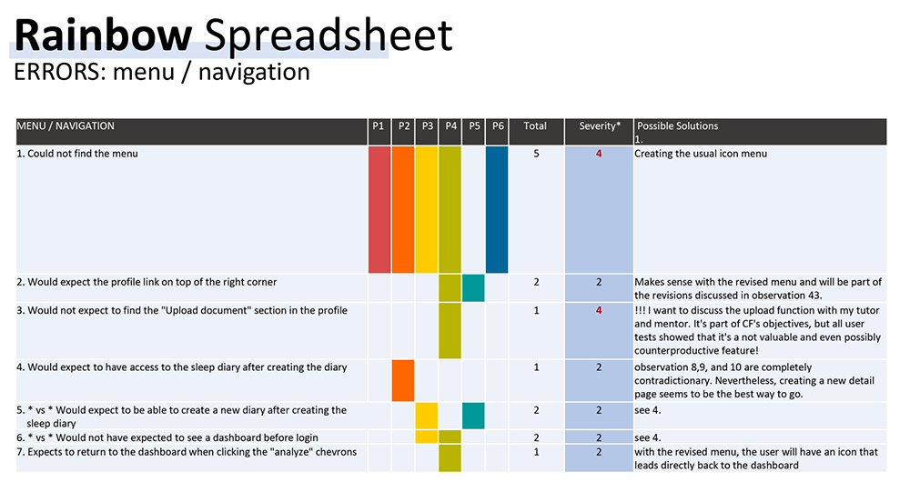
With all the data I had gathered during my user tests and interviews, I put together the new Information Architecture, updated my mid-fidelity wireframes, and conducted usability tests with 6 test participants (each one marked in a different color on the „sticky notes“ and the spreadsheet below). I sorted the data according to the topics (menu, dashboard, etc.) and highlighted all errors. The user statements were classified according to Jakob Nielsen’s four-step rating scale, from „cosmetic problem“ (1) to „usability catastrophe“ (4), latter errors of course were immediately amended.
The results laid the foundation for finally starting to build the app.
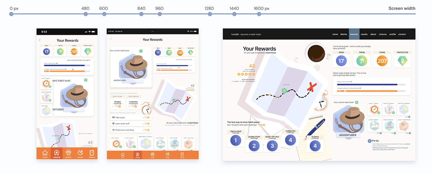
breakpoints, adaptive design and the adventurer’s storyline
Now I defined breakpoints for responsive design and started designing the UI for the first screens, starting with the most complex one: the new „rewards“ section. In terms of content, here would be the biggest differences between mobile and desktop devices. Education in healthier habits had been a favorite feature in the early user interviews, but at the same time, nobody wants to read a lot on a small device. Here, the different devices would offer different options – smartphones being the device of choice for daily diary entries, but extensive educational articles are better readable on a desktop device.
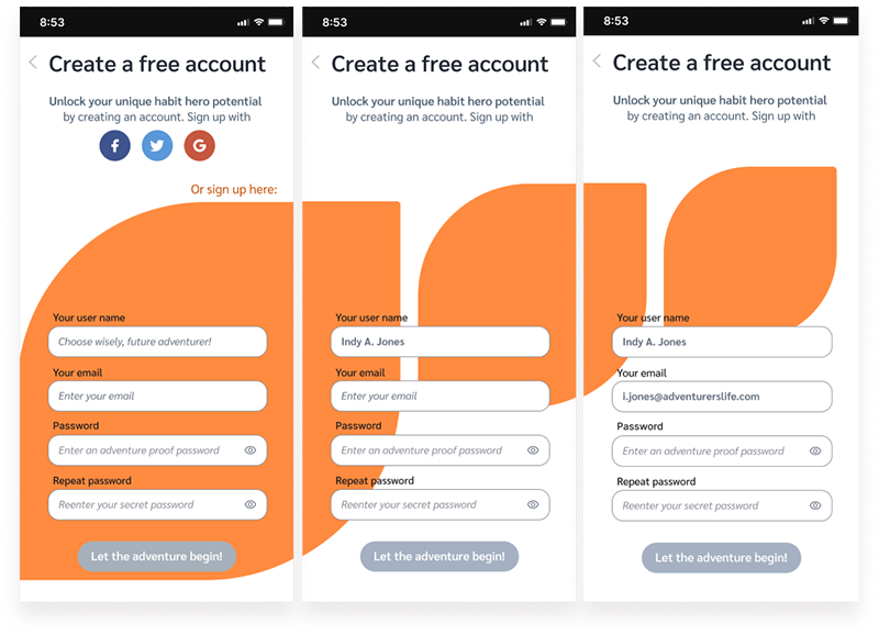
The different amounts of screen real estate on the three different devices didn’t only demand for structuring (or compressing) content chunks in different ways (adaptive design). For the desktop version, I also used a storytelling approach, making the available space look like an adventurer’s table in front of the user, planning the next steps to reach the ultimate goal of becoming a ‘Habit Ninja’. These background images could vary for each of the levels, thus demonstrating progress, and inspired me to create UX writing to make the user feel like an adventurer (f. e. by referring to Indiana Jones during the process to create an account – which usually is a boring, user-unfriendly process). Buidling habits can be fun, too!
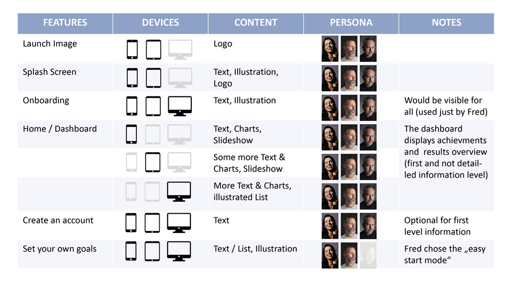
Additionally, I did a content audit and planned how to create and ‘chunk’ content for different device sizes, focusing on the three user personas, to understand how different user behavior might have to influence the screen design.
During this step, I also created the final icons for the menu. The storytelling approach helped me solve one of my problems: the ‘profile’ icon. Usual avatar icons use a male silhouette/ form, butI had looked for a gender-neutral solution. With the adventurer’s hat (and it’s reference to Indiana Jones), the icon allows the identification for all genders.
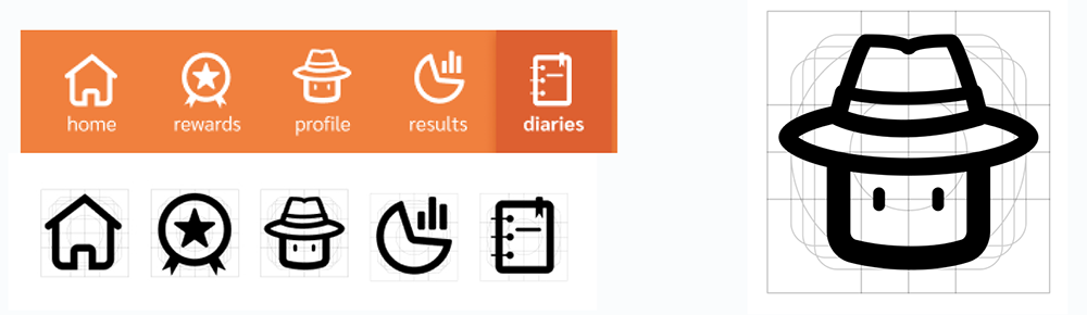
how to bind users: emotional design strategy, hooks and gamification
Humans don’t buy products, but emotions. To make any product (or service) successful, you have to trigger the brain’s reward center; this is especially important if you want to initiate behavioral change. An example: the global market for weight loss products and services is expected to grow from $254.9 billion in 2021 to reach $377.3 billion by 2026 (source: GlobesNewswire), selling mostly one product: hope. I wanted to sell less snake oil and more value: fun, data, and motivation.
To be a success, one fine day habbbit users would have to become paying subscribers. This is not only about earning money for the company. It’s also about sustainability in terms of customer service, product updates, new features etc., over the complete life cycle of a product.
Only recurring users have subscriber potential. I focused on three main psychological principles that make that happen:
The ‘Hook’ principle
To make a product or service ‘addictive’, two factors are pivotal: the frequency and the perceived utility for the user. F. e.: Google is where you go anytime you have a question (frequency), and Amazon makes it super easy to buy anything you want (utility). Approach: make useful, frequent actions a basic feature
The IKEA bias
Science demonstrated that even a small investment binds users to a product or service. The IKEA bias shows that consumers place a disproportionately high value on products they at least partially created. Approach: investment of the users in the app makes it valuable for them
Gamification
Gamification is a scientifically backed way to improve products, services, systems, and businesses by using game design features and concepts. Gamification basically triggers positive emotions and thus a positive association with the app’s use. Approach: make passing through the boring task of a behavioral change look fun
Solution(s) and new main feature
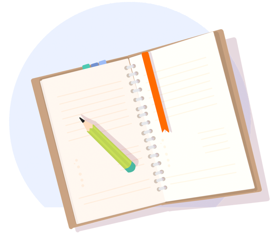
I decided to make diaries – daily (frequent) and useful actions – the core of the habbbit app. Each diary entry is also a personal investment, therefore, the user develops a deeper connection to the app with every diary entry, and thus perceives the app as valuable. The more data entries the user creates, the higher will be the ‘loss’ if he considers abandoning the app.
If a paywall restricts the ability to see data that reaches back more than a few days, the user might consider becoming a subscriber to see more of his data.
Gamification elements: Levels
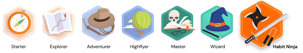
I created a gamification system with levels, challenges, coins, badges … all the fun gamification stuff, embedded into the adventurer’s storylineline – with becoming a ‘Habit Ninja’ being the ultimate goal. Since this needed custom-made illustrations, I also created all illustrations in the habbbit style and color palette.
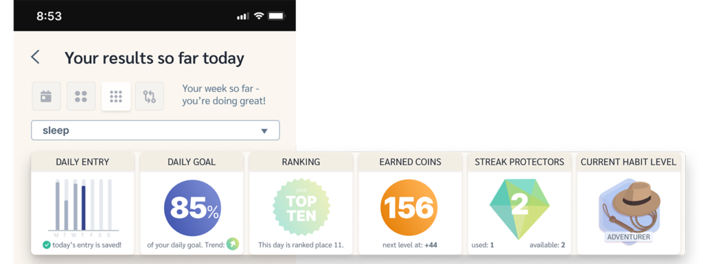
Gamification elements: Ranking, Coins etc.
I implemented the complete „rewards“ screen you’ve seen above – rewards being the most requested feature of the interview participants. And all throughout the data app, beyond the mere data display, I implemented a lot of gamification elements like scores, trends etc., thus making the user expectation come to life that any action deserves an immediate reward.
the fun part: content design, UI elements and UX writing
And then, I built UI Elements: cards, chips, toggles, charts, and animations. While UX research delivers the groundwork or foundation, each UI element contributes to the user experience while exploring the app’s features.
To highlight the emotional approach of habbbit’s concept, I choose a more light-hearted tone of voice for the UX writing, and put a lot of emphasis on motivation.
Many iterations later, some of thescreens looked like this:
coming to life: interactive high-fidelity prototype
From this point on, adjustments and user feedback went hand in hand through several rounds of iterations. The input of possible end users, as well as from peers and my course mentor, gave new insights and inspiration on how to make details and functionality better. I created and tested different user flows, showing and testing all important functions of the app (click to play the videos of the prototype in full action).
sleep diary/entry
data evaluation
document upload
(see the complete prototype as a video here >)

Petra V.
User Interview Participant and Health Enthusiast
„I totally would use this app. It looks like fun and, at the same time, delivers a lot of insights. My favorite feature is to compare my achievements; this would help me to make the most effective lifestyle choices!“
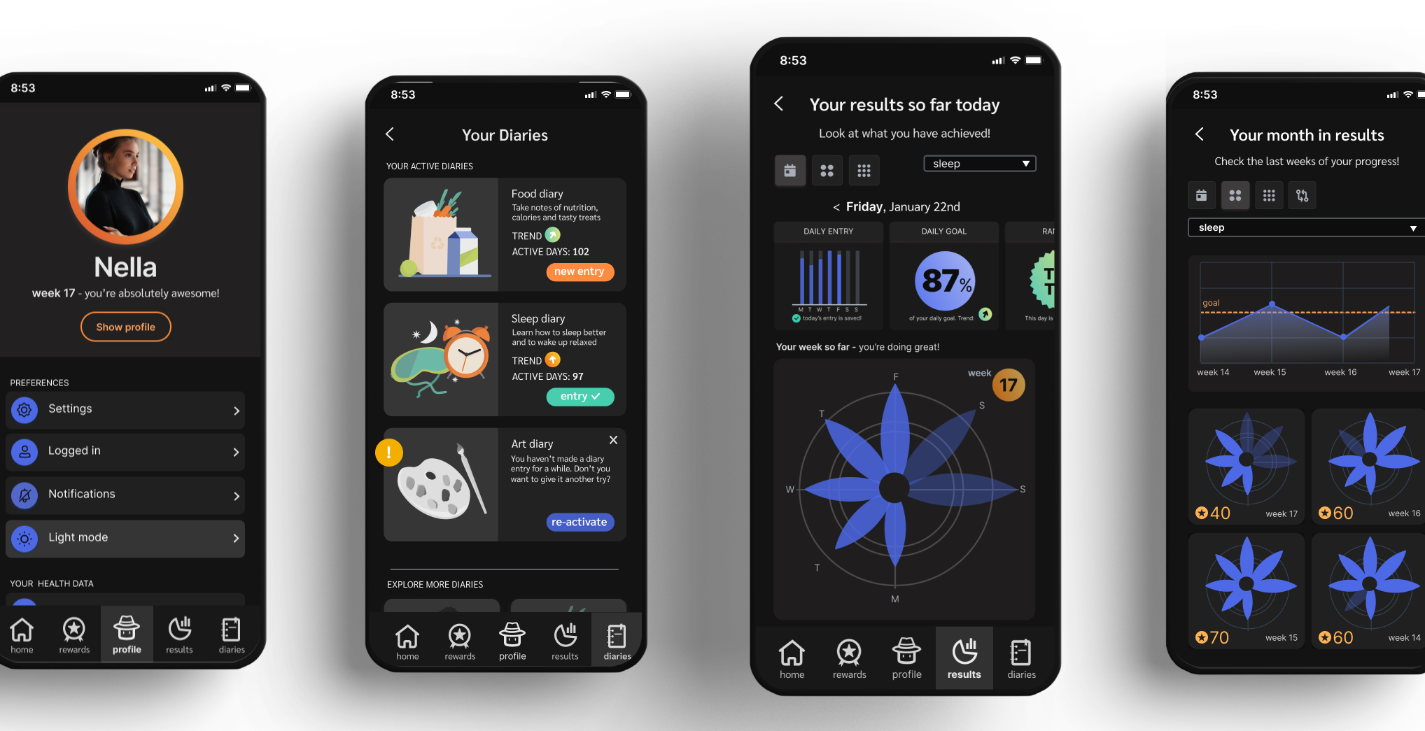
accessibility and about joining the dark side
Beyond color contrast, there’s more to consider in terms of accessibility. In this late phase, I did a lot of fine-tuning – from increasing the contrast by making the background slightly darker (so the white cards stand out better) to small amendments in content hierarchy. And I changed the font to a font family with a minimal narrower type width. The UX writing and microcopy were done, and I knew the amount (and length) of text I used in the app, With the narrower font, I could slightly increase the font size for better readability. Even when I had switched from the Baby Boomers – the initial target group – to users of all age groups, readability always is an important topic.
Dark mode also is often associated with better accessibility. Dark mode became popular due to the assumption that white fonts on a dark background would enhance the readability, help with focus and create less strain on the eyes. But studies show that dark mode excludes people with Astigmatism (about 25% of the population). Nevertheless, dark mode could be an additional option for habbbit.
consistency, the habbbit design system and style guide
Consistency is one of the most important aspects of user-friendliness (resp. a key principle of UX). Consistency will make it easier to explore and use an app, which will provide the users with a feeling of ease and control. A good emotional response from a pleasant encounter with an app will increase the likability to become a habitual user, and thus support the retention and subscription rate. So I made sure all throughout the process to work with a design system and consistent design elements (font family and sizes, spacing, colors, etc.)
From a designer’s perspective, working with a Design System and components makes last-minute changes – like the change of the font family – easier and faster.
All throughout the different project phases, with each color choice or design of a UI element, I worked on my design system. As the last step, I polished the elements and created a style guide as a PDF.
 Style Guide
UX definitely delivers a lot of value, both for the users and the business.
challenges, obstacles and considerations
Having facilitated design sprint workshops for a while—extremely fast developing, prototyping, testing, and iterating a new feature for a product or service within just one or two weeks – I loved the approach to building an app over the course of more than six months. I really enjoyed every step of the process, especially the „luxury“ of all the in-depth UX research that no real-life budget can provide. I also appreciated the time I spent with all those tests and iterations – sometimes surprising, often affirming, but always showing the importance of UX research, even late in the build-and-design phase. Failures, like the initial hypothesis or the too ambitious flexible design system attempt, were also not in vain. There’s a saying that „detours increase local knowledge“, which definitely always proves right in the case of the UX process. Without time and budget pressures, I happily took on literally hundreds of iterations and amendments, and I easily could work on the project for another six months, diving deeper into content and additional functions (challenges, education, etc.).
If possible, I became even more enthusiastic about all UX disciplines, from research to strategy, prototypes, and finally UI design. And more than ever, I am convinced that good UX or CX (user experience/customer experience) has the potential to make the world a better place. Maybe just on a small scale or for a short period of time, but UX definitely delivers a lot of value, both for the users and the business.
Acknowledgements
Being a passion project without a budget, I am deeply grateful to all participants of my endless user tests. And even with some years of experience in a field, you always can learn something new – and from feedback from others. I’d like to thank CareerFoundry for a really good user experience (course & team), my mentor Lyubomir Mateev for being an inspiration in any way and Lana Anicic for her excellent peer reviews and input.