CASE STUDY 3: e-LEARNING PLATFORM, CERTIFICATION AND AFFILIATE SYSTEM
How science won over certfication restrictions for an eLearning platform
market research user research psychological approach course concept content creation infographocs & visuals project management UX writing §20 certification affiliate system
background story
In 2016, when everybody talked about digital transformation, nobody knew where the journey was headed. And – platforms were becoming the next big thing (pointing out to the trend or need of connecting things and people).
I did design sprint workshops for smaller and medium companies these days and found that there were a lot of buzzwords flying around – especially here in Germany – but most companies didn’t know what to do and where to go. Digitalization for some meant just a paperless office, and what was the data thing about?
When my most innovative client approached me to give his business a new direction, as a first step, we narrowed the fields down to three topics: innovation, digitalisation and occupational health care/employer branding. We decided to go with the flow – so I built an information platform (with information being what everybody needed at this moment in time) and let the users (aka: data) decide, based on the hit rate/ page impressions of the three different parts of the new platform: akademie 4.0
After a year of checking statistics, doing user interviews, attending events and some testing, we had a frontrunner: health care / corporal environment / digital product or service.
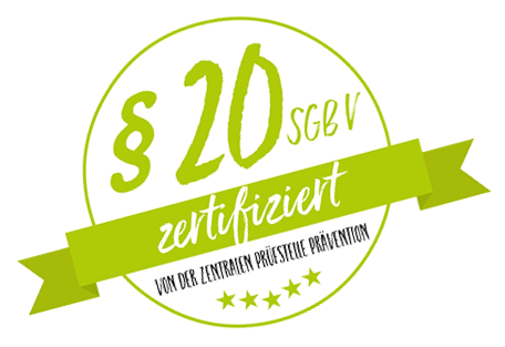
With this in mind we came up with the idea for a precise product: a digital online stress reduction course with cost coverage by Germany’s health insurances. This basically was the “gold standard” for prevention courses – with just one “little” hook: we needed to get a certification, which was supposed to be nearly impossible.
> where
Cologne, Ekrath
> when
2017-present
> what
e-Learning platform, $20 course certification, content creation, affiliate system, database & tools
> client
Xara Business Solutions GmbH
> my role(s)
step 1: everything related to research, concept, design, content & course creation, certification & evaluation
step 2: Developing an automatized affiliate system, marketing & social media tools, manual etc.
step 3: Teambuilding, Presentations, Webinars
> goals
Digital Prevention / Healthcare Solution for Operational Health Management
The brand aspect
Besides of creating the most user-friendly course the certification guidelines allowed us to do, the entire project was aimed at making branding for others possible. The course was marketed by an affiliate partner system, which meant it couldn’t clash with the branding of the affiliates (coaches, trainers …). They sold the course to their clients as a part of their own (digital) portfolio, so the course branding had to be correspondingly reserved. The clients in turn could book a branded landing page with the company’s CI as an individual onboarding for their employees. Thus, branding others was part of the main concept for this project.
project overview & tasks
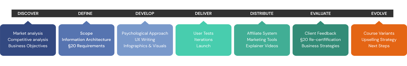
the challenge
Creating a customer-friendly online course based on insights from neuroscience’s cutting-edge research – while meeting the “gold standard” certification requirements and massive constraints of the §20 verifying authority.
industry standards
I had worked in some larger companies’ e-learning projects for several years, so I had first-hand knowledge about how online courses usually were structured and designed. I wanted to do better.
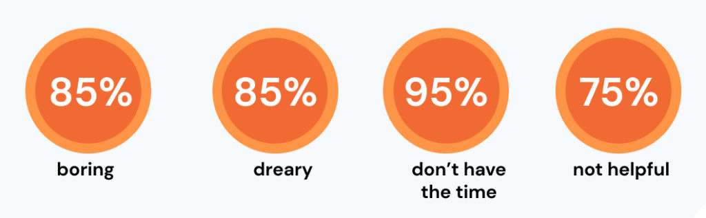
A fast survey brought up the biases most people associate with stress reduction courses (20 participants via an online survey tool).
10 brain based learning strategies
To make an impact on the market, we had to be to be distinctive. To make learning successful, sustainable and fun, I wanted to implement cutting-edge neuroscientific knowledge.

I defined 10 neuroscientific-based rules for creating the course / content:
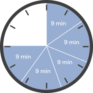
- “chunking” content: I spread 45 minutes per week to a digestible 9 minutes per day, for 5 days a week
- varied topics: In consideration of the certification restrictions, I mixed varied topics to add an element of surprise
- evaluation options: Psychological self-tests are pretty popular. 37% of the course content can be used for evaluating or re-evaluating the participant’s situation e.g. progress
- emotions rule: Tone of voice and Wording are designed to entertain, touch and support
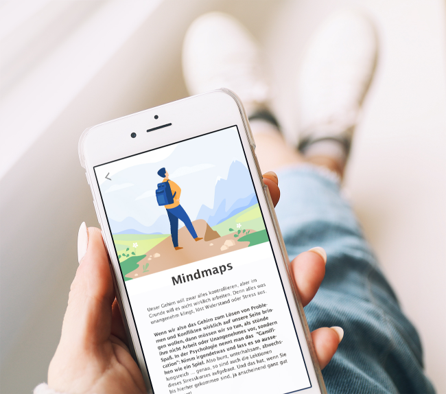
- visuals, visuals, visuals: I developed visuals and infographic posters and a workbook to make the learning experience tangible, appealing and memorable. Our brains love visuals, plus it remembers them better and longer
- meaningful tasks: The lessons target everyday, actual situations and deliver tons of helpful tools
- practice is the key: Lifestyle changes don’t happen by mastering the theory. 92% of the lessons include practical, feasible steps – and tools that help making them
- creating habits: Changes don’t happen overnight, too. The 9 min/ day pace translates to making habits a routine (studies say that we need 6 to 9 weeks to make something a habit
- envisioning the future self: The lessons make a direct connection to a more empowered self, step by step
- celebrating success: The reward center of our brain is the best ally for change. Motivation and success feedback are interwoven all throughout the course.
structure/information architecture
1. the business perspective:
In a highly saturated market, §20 is the „gold standard“ for all prevention courses. The verifying authority (ZPP / Zentrale Prüfstelle Prävention / central evaluation body for prevention) dictates the rules, but it was neither prepared for digital courses (usually evaluating live yoga and meditation classes) nor for any new approaches. The usual course format is 8 lessons of 45 minutes each – translating to 8 videos of 45 minutes, as it concerns the competitors. This wasn’t a user-friendly format – at all.
The client had decided for a target group/setting: he wanted to offer the course in the operational health environment. This would mean a faster turnover than selling to individual customers. But this idea came with an additional restriction: at a workplace, 45 min at a stretch was completely unthinkable, the same was valid for 30 minutes and even 15. I made a quick survey in my network, and 7 out of 9 participants estimated that 10 minutes would be the maximum – far from the predetermined 45 minutes.
the solution
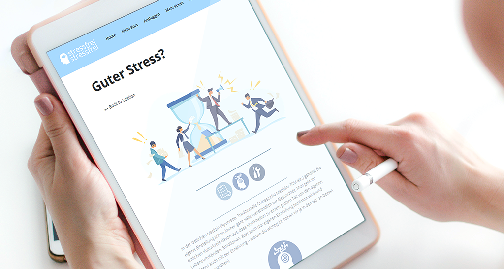
I decided to break down the 45 minutes/week to 5×9 minutes per working day – hoping I could get this certified.
2. the user perspective
From lots of studies, I already knew that 45 minutes, especially online, are more than suboptimal. Smaller pieces/chunks are way easier to grasp and integrate into a daily working routine. Additionally, our target group was supposed to be stressed – and stress contradicts with attention and concentration. Smaller units also made sense from the user’s point of view.
topic/content strategy
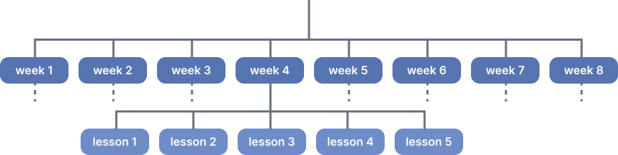
There are tons of studies and concepts about stress reduction. I did a competitive analysis, searched top ten topics and best practice tips. I came up with a long list of possible topics, narrowed it down to the most important ones and weighted and sorted them according to the certification requirements – to end up with topics for 40 content chunks.

To make the amount of different topics transparent, I developed a color-coded series of category icons (mind, body, science, tools, exercise etc.) to serve as a guidance system all throughout the course.

the look and feel & color palette
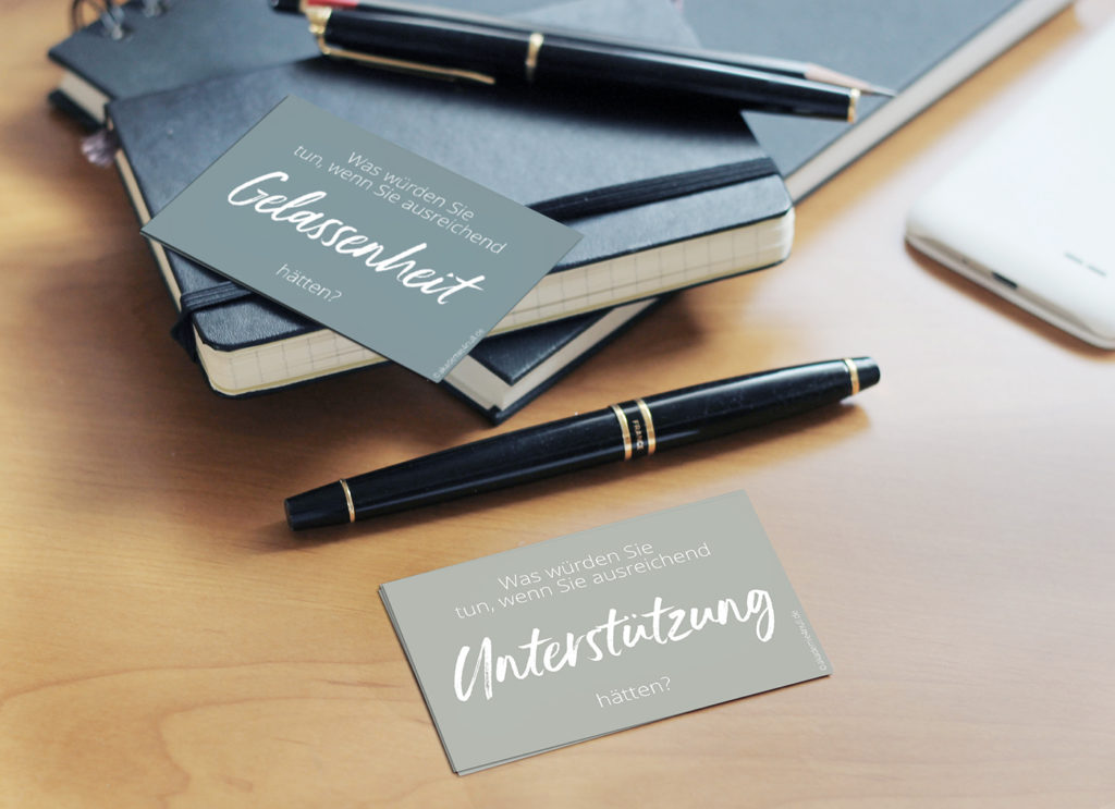
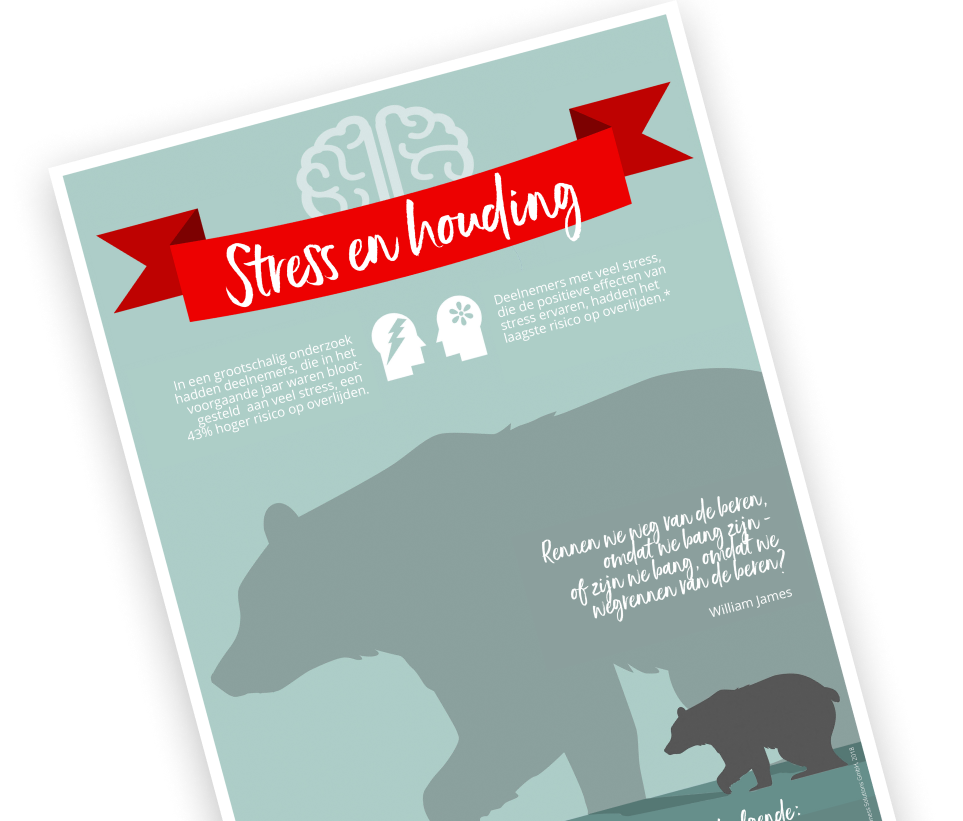
One of my pre-defined learning strategies was the focus on visuals. I created and illustrated postcards, small and large posters, worksheets, and much more.
These deliverables served two purposes. First, they aimed for the obvious: delivering condensed information in a visually enjoyable form. Printed, they were meant as reminders – pinned on the fridge door or attached to the office wall, they underlined the topics for a sustainable long-term effect.
But our course was also designed to support both team leaders and business coaches. Each topic, each poster, was created as a “hook” to invite actions, interventions, or backing. The printed graphics made it easy to choose a weekly topic or a subject for a team meeting.
Everything was meant to look nice, easy, and personal. I picked a handwritten font to make the graphics unique, and a slightly desaturated color palette to fit into any office environment. To make everything appear bright and upbeat, I complemented the color palette with a contrasting red for attention and highlights.
making things easy
On a biological level, stress couldn’t be more complex – it influences literally every body function for the better or worse. The requirements of the certification agency included a certain amount of educational parts, which usually were the most boring parts of the competitor’s courses.
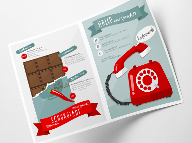
I used a storytelling approach to process complex issues. Why not explain three different brain parts’ reactions to stress with chocolate? How could the communication between the three parts be better demonstrated than with a conference call between the parts? The subtle retro look of the color palette and illustrations was aimed at reminding a bit of the vintage school wall maps of scientific topics.
tools, tools, tools
Since fun and practice were supposed to be some of our USPs, I developed a series of “action cards” that invited the course participants to spontaneous actions. Want to make a decision and doing easy? Take a card. Need more resources? Run through a simulation with a card.
When we tested the course, the cards were named as favorite features by 68% of the participants.
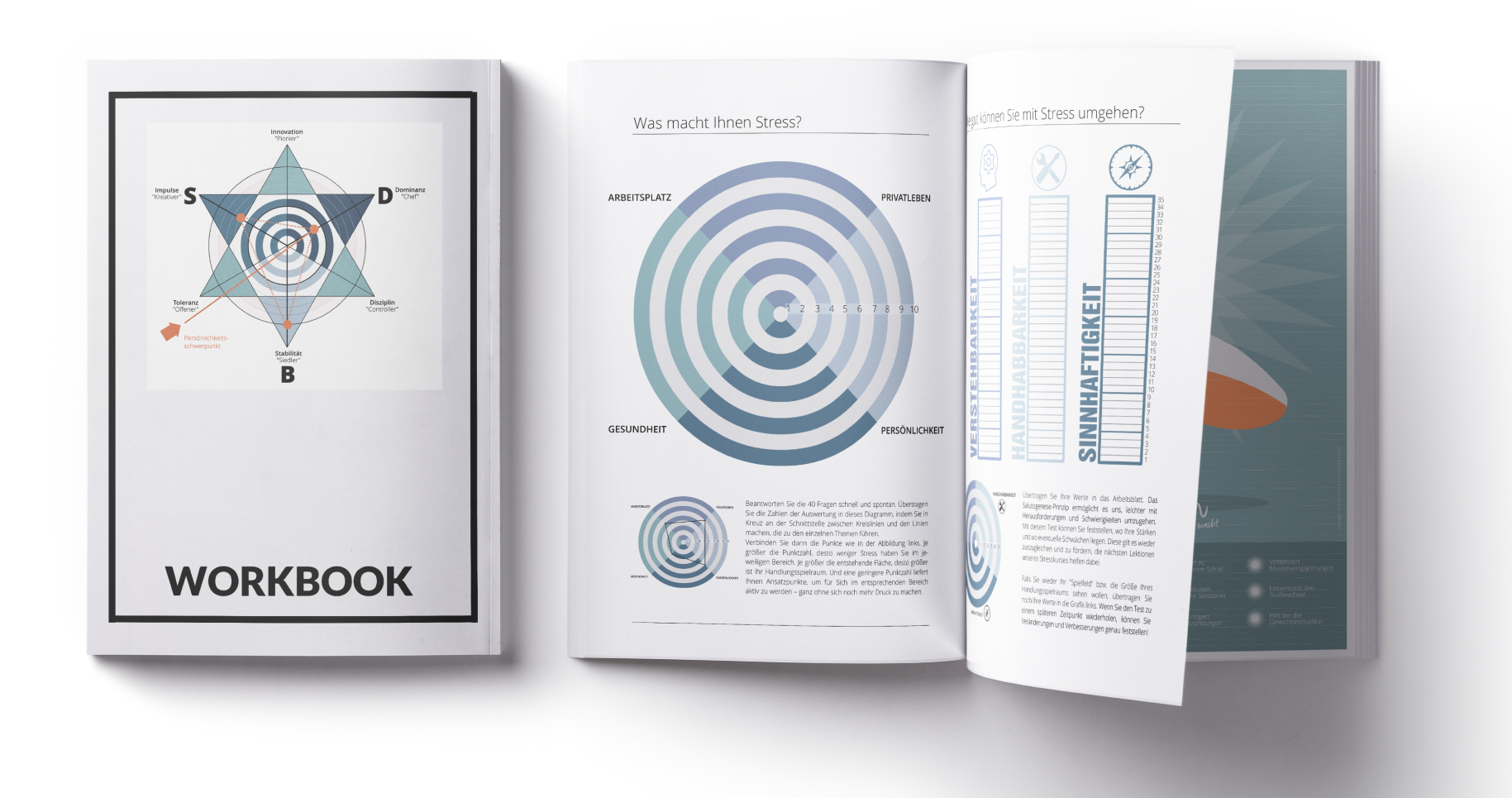
the workbook
Learning is more sustainable when practicing the lessons in real life. So besides visual reminders like posters, postcards or activity cards, I created a workbook. This not only delivered the course material but also showed the user the progress he or she made during the eight weeks‘ course.

VJATESCHESLAV H.
Founder of Xara Business Solutions GmbH
„Industry experts didn’t believe that we could get the §20 certification with the new, science-based and unique course concept. We did it, and got our newest (second) re-certification right now. Some insiders called it a “money printing machine”.“
the affiliate partner database
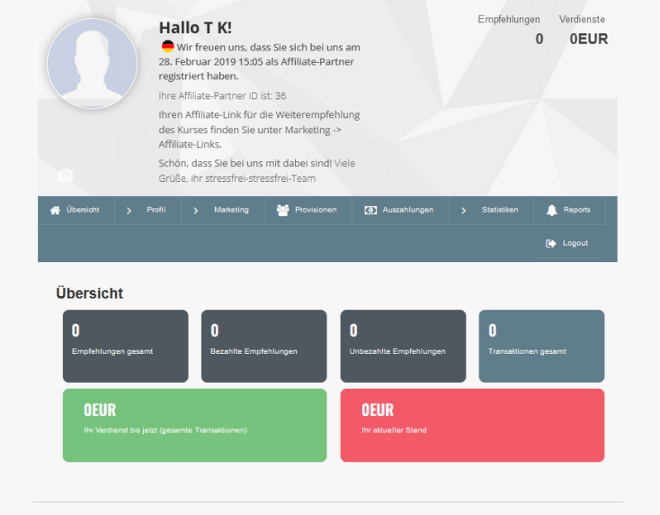
While I was waiting for the certification feedback – all together 6 rounds of (often major) iterations over the course of 6 months, including setting up a completely new learning platform according to their demands – I started to set up the affiliate system the client wanted to use for marketing.
I wrote a list of requirements and started searching and testing WordPress plugins for automatized affiliate systems (user administration and accounting overview), until I finally found one that met most of our needs. I advised my programmer how to adapt the rest and did a lot of user tests until everything worked smoothly (images below: backend/login area).

affiliate training & marketing materials
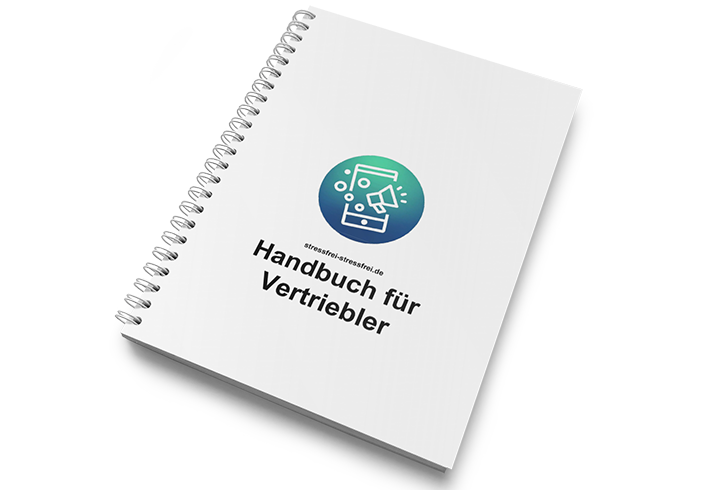
training materials
The following user tests with the first affiliate partners brought a lot of new tasks for me: I wrote a user manual for the affiliate backend. I wrote a manual about how to promote and market a digital product. I created explainer videos on how to subscribe new users (having a 4-level affiliate system), gave webinars and presentations, and trained a small group of coaches. Likewise, I created a quick-start online course for beginners to avoid having webinars all the time, with the most requested feature implemented: business concepts for different target groups (coaches, alternative practitioners, pharmacists, etc.). And I developed checklists, step-by-step guides, and lists with the course USPs and presentations.
promotion materials
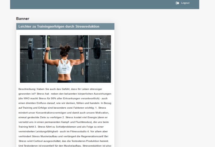
To make the promotion of the course easy for the affiliate partners, I created a YouTube channel with all related videos and provided a series of ready-made social media posts for different target groups and topics in the affiliate backend (see image below: „The way to easier training success with stress reduction“).
trial courses and onboarding
As the last step, I created two mini-courses for promotional purposes, with three additional lessons each that at the same time worked as an onboarding program for our course, explaing the background and conditions.
the Dutch version
This project sparked interest from another company in the Netherlands. So, along with a translator, I did the whole course in Dutch.
the certification „nightmare“
certification, re-certification, new certification and new re-certification
After a year, we had to re-certify the course. I conducted a study, revised the nearly 100 pages of required course documents, and received the re-certification.
About one and a half years later, the verifying authority completely switched their concept for course certifications – with a different structure and new requirements that didn’t allow our initial approach. We had to start anew. I developed a workaround, came up with a new structure that disguised our 40 lessons as 8, and got a new certification after about 5 months and 4 rounds of iterations. In summer 2022, I re-certified the new course concept, and future re-certifications will be a lot easier.
re-certification results
The ZPP/certification authority required four questions for the evaluation for the re-certification:
The course …
1. motivated and enabled me to use the new knowledge and abilities and to integrate it into my day-to-day life
2. had a clear goal and focus on stress reduction
3. was interestingly presented, easy to follow and also useful for untrained persons
4. contributed to a generally improved health status
I added a fifth question to the survey to refer to our main approach of self-empowerment:
5. showed me that I am able to be proactive for me, my health, and a better life

The online survey with 36 participants, who had just finished the course, showed a clear picture. We got 100% approval in all but one question – a question that once more showed the importance of what questions to ask. A “generally improved health status”, which the ZPP was suggesting, is way too broadly defined (in fact, not defined at all), and makes no sense. To measure that, one would need a reference value and a selection of participants with a comparable health situation (not even mentioning a classical scientific before/after study). But overall, the re-evaluation study showed that we had done a pretty good job with our course, and we got the re-certification.
PARTICIPANT 12
of the re-certification study
„I loved the course and it helped me understand my situation and how stressed I am sometimes. I also loved seeing my progress. And for sure I will use some of the tools further on!“
the mobile-friendly, slimmed-down version
The certification gold standard was all but user-friendly, which we knew from the beginning – it was the price we had to pay.
After a year of sales and feedback from our affiliate partners, we decided to create a slimmed-down, shorter, and mobile-friendly course version as an alternative. Of course, we couldn’t apply for a certification or cost coverage, but the clients could now choose between a free or a more user-friendly shorter version.
challenges, obstacles and considerations
To be honest, if I would have known the absurd amount of changes and requirements the certification authority demanded, I wouldn’t have accepted the job. I see the irony in the fact that creating a stress reduction course was one of the most stressful projects I have ever done. I only learned that there was a real chance that I would get the certification after more than five months into the job.
And I totally underestimated how difficult it seems to promote a digital product via a link. This was another setback at the end of the project (I admit to not having made user tests about whether affiliate partners would be able to send out emails or distribute QR codes in advance). But even the biggest hurdles turned out to be opportunities and confirmed once again that problems can be solved and good UX and user-friendliness pay out in the end.