CAse Study 1 : MEDICAL Software ADAPTION FOR A NEW MARKET NICHE
The 0 € budget software that got a 100% user approval
research  concept
  user flows
  information architecture
  UX writing
  UI adaption
  web dev hack
  user tests
  studies
  evaluations
background story
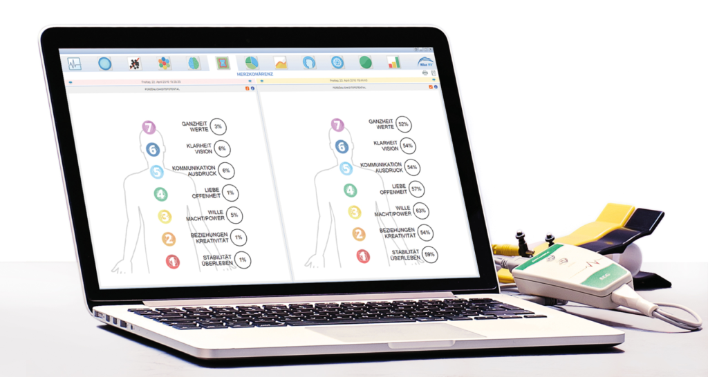
HRV scans are a non-invasive technology that measures and rates the small variations that occur with every single heartbeat. Heart rate variability is used f. e. in areas such as emergency medicine, cardiology, and oncology, but also in prevention and stress reduction.
I freelanced for 10 years as an HRV software trainer and could see at firsthand how bad UX made lots of users struggle. The company didn’t have any funds to invest, so I came up with a zero-budget concept and delivered a new software – together with a completely new application concept and target group.
> where
Cologne, Hamburg, somewhere near St. Petersburg
> when
march – october, 2017
> what
medical software (heart rate variability device)
> client
Nilas MV GmbH
> my role(s)
everything except from the final software implementation
> company goals
- – new software version for non-medical customers
- – new target group for more sales (coachs)
- – considering all legal requirements for non-medical users of medicine products
The brand aspect
In this project, I neither had the assignment nor the budget to create a brand experience. Nevertheless, UX/CX also works „bottom-up“, that is, from a customer-orientated product to more customer-friendliness in other areas. The software alone made working with the new software version way easier. But I added another level of experience into my basic trainings for the software: detailed instructions on how to explain the software data to the final customer – the software user’s clients/patients. By introducing user/client-friendly UX writing into the software and adding user guidance, the client sessions resulted in a new, client-orientated experience, that in turn contributed to the overall brand image.
project overview & tasks

the challenge
A high percentage of users (50-70%) failed in using or didn’t use certain features of the software. More than 90% needed more time than necessary to understand and communicate the results. But all I had was zero budget, a Russian software without any documentation, and minimal scope for design changes.
background research and usability
unvoluntarily ethnographic field study
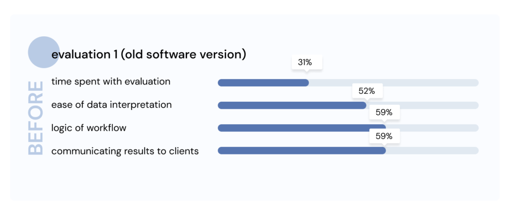
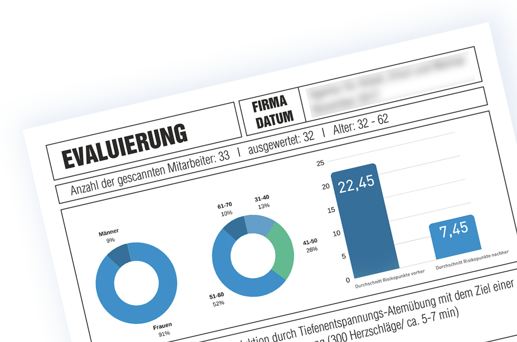
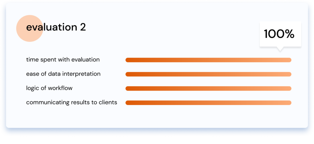
I gave basic and advanced training for new and experienced HRV users. Seeing how and where many of them struggled made me understand where the software failed them. I took notes for nearly two years and interviewed the participants of 3 trainings (37 persons, see evaluation below). I asked about their satisfaction with the following 4 parameters:
post-launch results
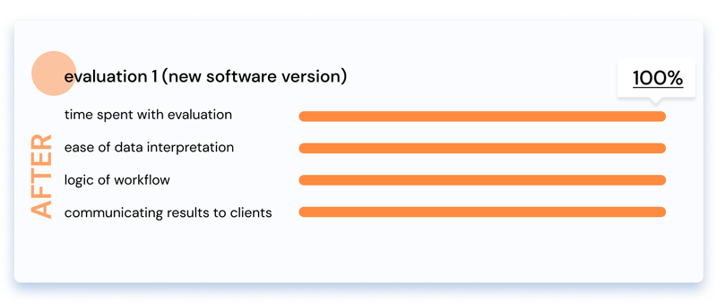
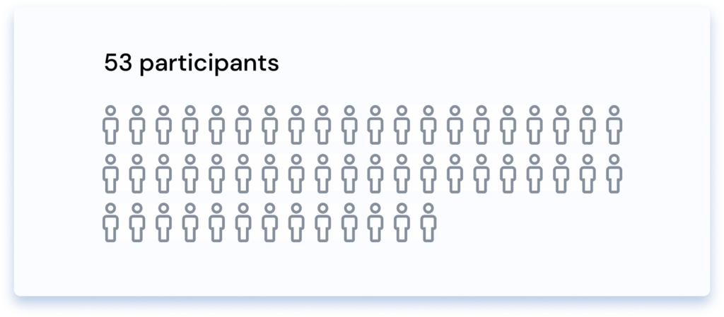
I created a new software version to meet the needs of two categories of users: 1. The company’s direct customers – doctors, health practitioners, and much more – and 2. their clients. The final user interview of 53 training participants (not identical to the interviewees from evaluation 1) showed a whopping 100 % approval.
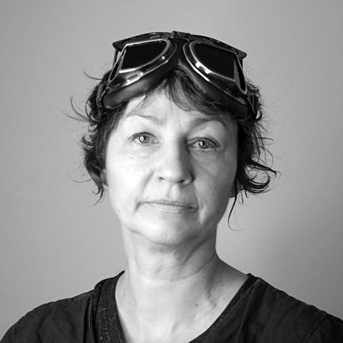
BRIGITTE M.
Alternative Health Practicioner
„It usually took me 1 hour to make a scan evaluation, and I had to create Excel tables to understand the data. With the new software version, I just need about 10-15 minutes, and thus I can spend more time with explaining the results to my clients.“
 software revision
step 1: content analysis and content audit
Based on the findings of my user interviews, I defined the most important pain points. Having used the software in various real-life projects, alone and with teams, I knew the steps and sequence of data analysis that lead to fast and thorough results. I analyzed the software from the perspective of different user groups, their course of action, and expectations for deliverables to make sure to meet all user needs.
step 2: removing all redundant information
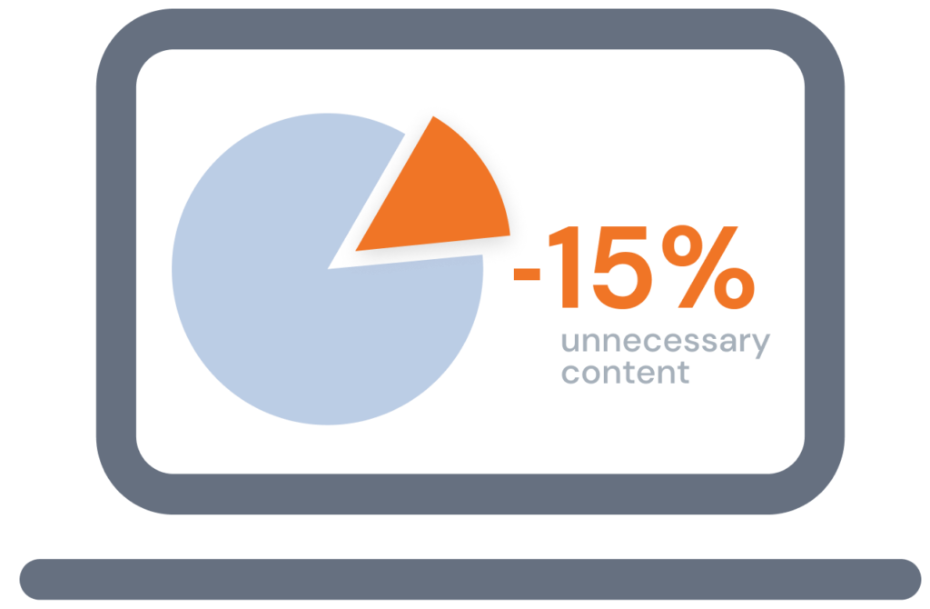
First, I removed all non-necessary, redundant or meaningless functions of the software. Not everything developers can implement makes sense when working with real patients. Streamlining the evaluation process made the software cleaner and sped up the evaluation process. I removed two of eight tabs / work spaces and made the software 15% leaner.
step 3: task flows and information architechture
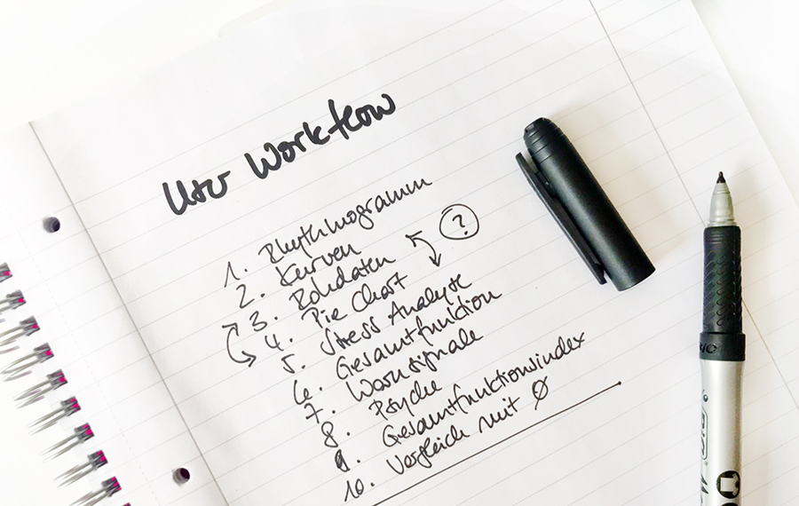
I created new task flows to make the workflow/user experience of evaluating the HRV data as smooth and easy as possible. This included as well the sequence of work areas as the structure of the data evaluation charts inside the different work areas.
step 4: UX writing and microcopy
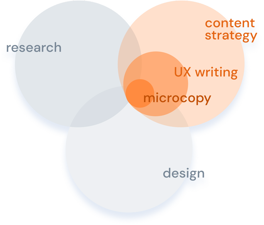
UX writing is more than just a nice button text (or, as a Google designer once put it, “It’s literally all the words in the interface – not just the cute ones.”). UX writing is rather part of the overall content strategy.
As you often can find in medical software, the naming of workspaces, charts, legends, etc. was created according to the developer’s point of view. It was neither oriented on the user’s procedure or mental models nor the wording the practitioners used to explain the HRV scan data to their patients. Basically, while using the software, the practitioners had to ‘translate’ the software language into their own thinking and then a second time into a language their clients could understand – in real-time. I came up with UX texts that could be communicated easily to the patients, that took error prevention and guidance into account, and enabled easy and safe data interpretation at every single step in the user journey.
step 5: layout adjustments


One of the major constraints for this project was the demand that the UI design should be as similar as possible to the existing original software, therefore enabling existing users a seamless switch from one version to the other.
I just created a more modern color palette and icons for the navigation bar in material design look.
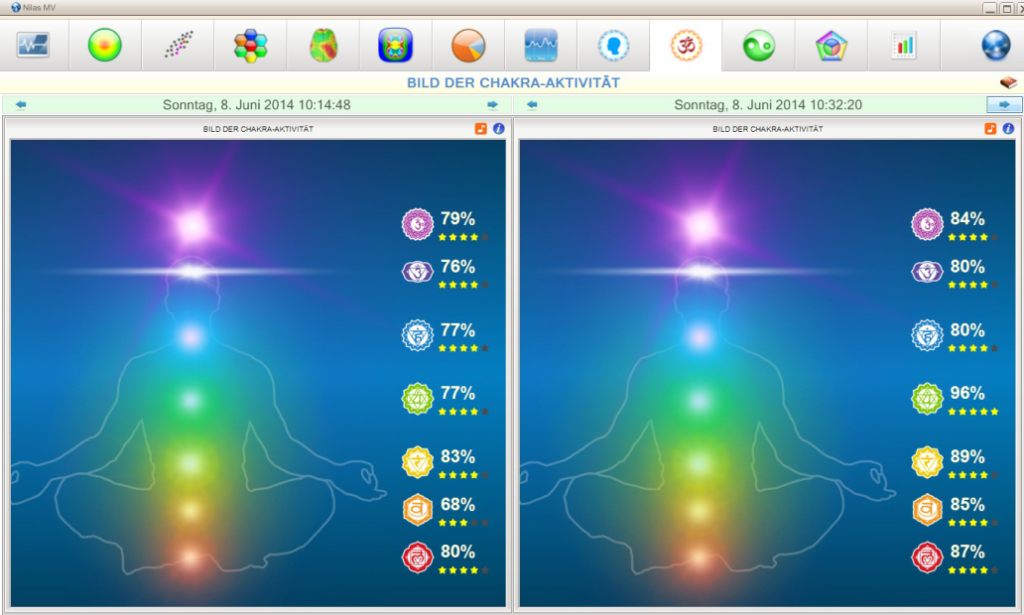
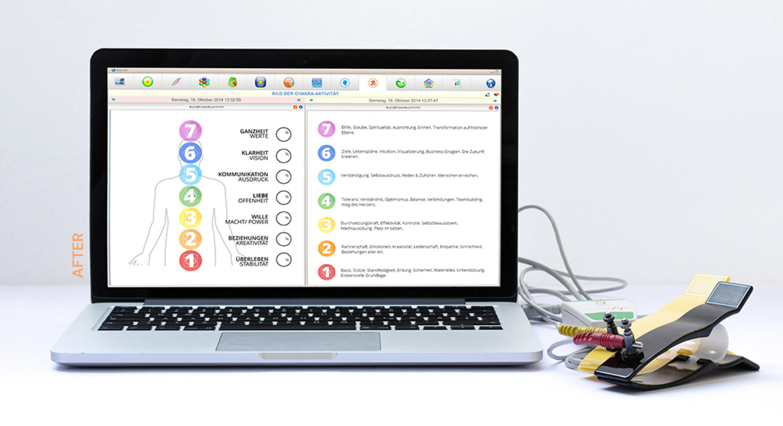
The only major design changes were the „hero images“ of the last two workflows – from an ‘esoteric’ look (customer complaint) to a more cleanand professional approach on a white background (image above). I included an extensive legend in the display, making the data interpretation much easier. In the post-evaluation, 51 of the 53 participants gave 100% approval of the new UI design, two didn’t answer the question.
step 6: the magical web dev hack
From my previous work on Russian software, I had a clear understanding of how the process of implementing new content would be. Since there was no budget, I also had to work with the explicit stipulation that there was no money for web developer hours.
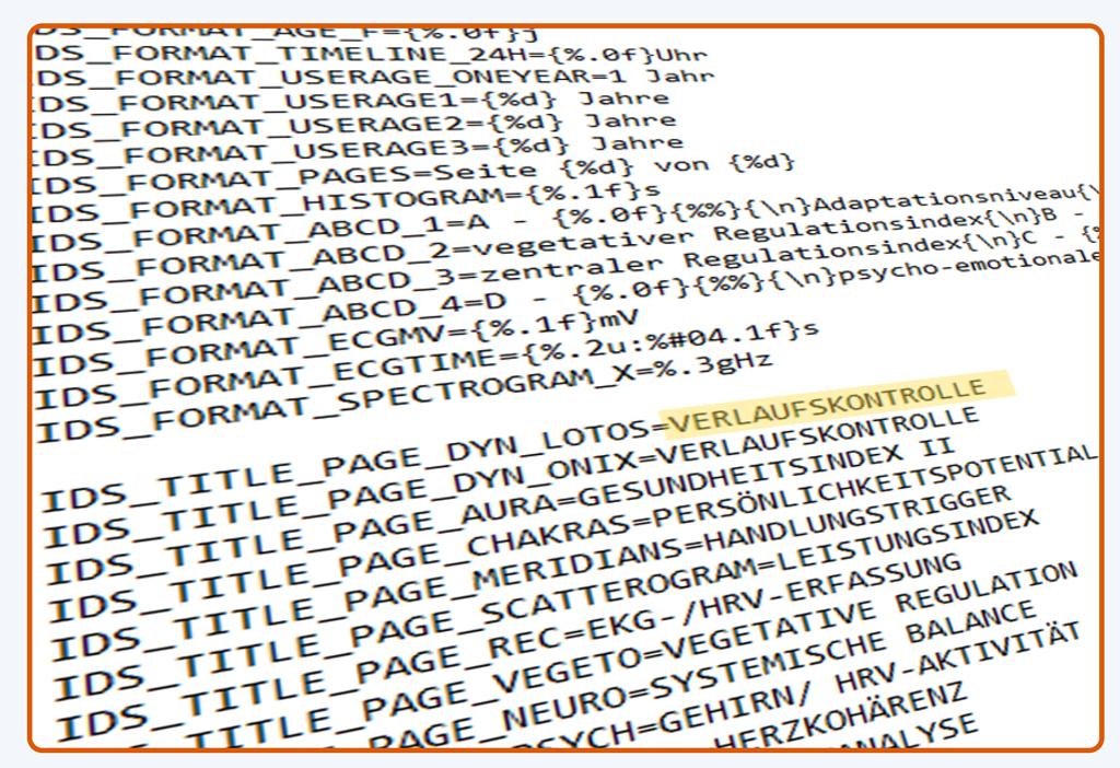
I made all text changes in the original file and renamed all new images in the same way the original images were termed initially. This way, all the developers had to do was to upload my new files into the old software folders and a new software was born. Small changes on this first version removed all errors.
beta and user tests
Leading a dedicated team of 6 users during a 3-days operational health management project, I tested the new version in real-life conditions with my team before the official launch of the software. Everybody was happy, and on average, ever user was able to scan two clients more per day than with the original software – without any stress.
The new software version didn’t only make the usage significantly easier but also turned out to be an effective time saver.
launch and presentation
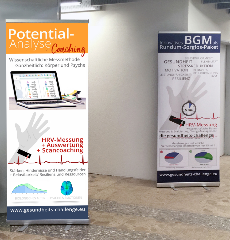
I presented the new software in a keynote during the annual client’s fall conference. Outlining the benefits, not primarily the features, I demonstrated new fields of possible application for coaching by showcasing different operational health management projects. Additionally, I pointed out the data evaluations I had collected during the beta test phase (more on this, see case study 2).
post evaluations and results
I trained new HRV users for my client for another 4 years and received overwhelmingly positive feedback about the new software version. During the months after the launch, I made a survey with 53 trainees that ended with a 100% approval rate for „my“ software version.
 „timesaver“
  easier evaluation
  consistent workflow
  better communication tool
  „enjoyable“
business approach
As I had initially suggested, the client used the new software for promoting the device to a completely new target group – coaches – and contacted existing customers with a special upselling offer. HRV devices are absolutely me-too products in a pretty saturated industry segment of purely medical devices. The competitive analysis I had made during the concept phase had shown that none of the competitors had anything near a comparable software for the nonmedical market. To my knowledge, this is still true today.
accompanying projects:
I have worked for this client over a span of more than 10 years. During this time I created:
- – application concepts
- – evalation data bases
- – manuals
- – e-learnings
- – marketing material
- – websites
- – training videos
- – technical articles
- – training videos etc.
reference book and e-learning platform
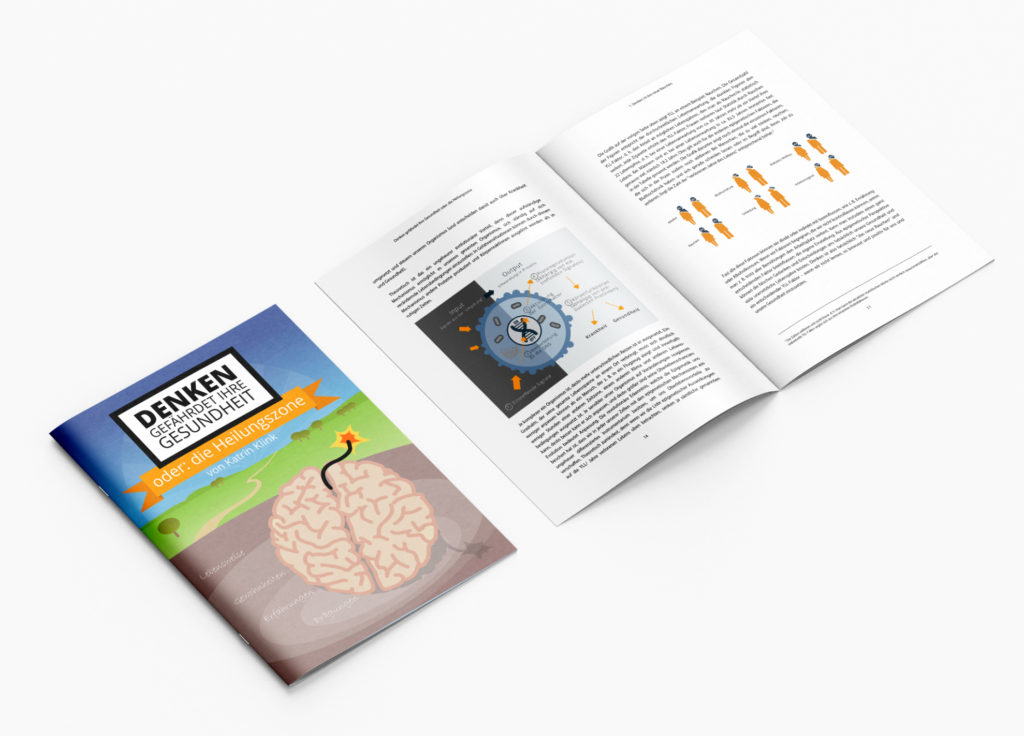
I was keynote speaker for this project on several annual congresses over the span of a few years and wrote and published a book (“Thinking is harmful to your health – the healing zone”) about my research and findings. To satisfy the demand for advanced knowledge and learning, I set up an e-learning platform and created interactive courses and video courses for the most requested topics.
challenges, obstacles and considerations
This story sounds fun but doesn’t have a happy ending. I loved the project and created dozens of additional tools and platforms on my own account. Despite all this, and after 10 years of happily training the companies’ users, I ended the cooperation in the spring of 2022.