CASE STUDY 2: CONSULTING, POSITIONING, UX RESEARCH & WRITING
With UX consulting to a sustainable product, pitch & pricing
consulting positioning
 USPs
USPs  concept
  employer branding
  study design/test/evaluation
  project management
  eMagazines
  content design
  UX writing
  product packages & pricing
background story
As a close runner-up of one of the world’s biggest aging populations, the German industry has a severe and aggravating problem with a shortage of specialists. Industry experts estimate that until 2030, this will lead to a loss of about $630 billion – or 15% of Germany’s GDP / gross domestic product.
Thus, employee health programs become more and more important, both in terms of preserving the labor force and employer branding. One of my clients tried to find a market niche in the highly competitive coaching segment. I developed a concept where he not only could make his USPs shine, but use his network for joint marketing via a series of e-Magazines.
> where
Cologne, Stuttgart, all over Germany
> when
end of 2016 – 2022
> what
concept & tools for operational health management
> client
LQ4you
> my role(s)
everything: research, positioning & branding, USPs, concept, webdesign and marketing tools,
e-Magazines, content, text, explainer videos, presentations
> end customer (enterprise) needs
- – understanding of the legal requirements
- – health care for employees & employer branding
- – data & evaluations for documentation and planning
- – digital solution (pre and post COVID)
The brand aspect
This project was all about creating a branded product in the first place. Analyzing the strengths and USPs of my client showed that meeting the legal requirements were the main „hook“ in terms of positioning in the market. But to make this offer customer-friendly, we added a few service-orientated layers to the basic offer to create a full service package for his future clients – adding new modules on the go.
project overview & tasks

the challenge
Create an outstanding product/service in the highly saturated market of operational health management that meets employers‘ needs for all legal requirements. At the same time, it must be accepted by the employees that don’t want to provide information about their mental health state.

MICHAEL S.
LQ4you Owner, Coach and Consultant
„With the new concept and tools, especially the 1-min-explainer videos on large interactive LED displays, it’s much easier for me to present my strategy and USPs on congresses and fairs and to sign up new customers.“
market analysis
After a thorough research, I developed a mapped overview of the contributing factors that had changed the role of the customer over the years, thus making UX Design crucial: New technologies (primarily the use of mobile devices for research and shopping) had drastically changed the customer behavior and expectations (f. e. price comparison on the go). These days, customers create the brand images, not the brands itselves.
I used this map in lectures, workshops, and presentations to point out the big picture, the actual situation and the trends to be considered as influences for our projects.

Being a crucial part of the meta topic employer branding (1), operational health management (2) is a main contributing factor to motivation (3). Here, as one of its main pillars, our final solution/product, stress management (4), is positioned.
The target group of my client (mainly small and medium-sized companies with 100+ employees without requirements of a company physician) had to meet the legal requirements. We wanted to additionally add value and productivity (5), the ultimate goal of the target group.

raising the future customer’s awareness
Starting with the approach that would need the longest to implement, my first step was to develop a tool that raised awareness.
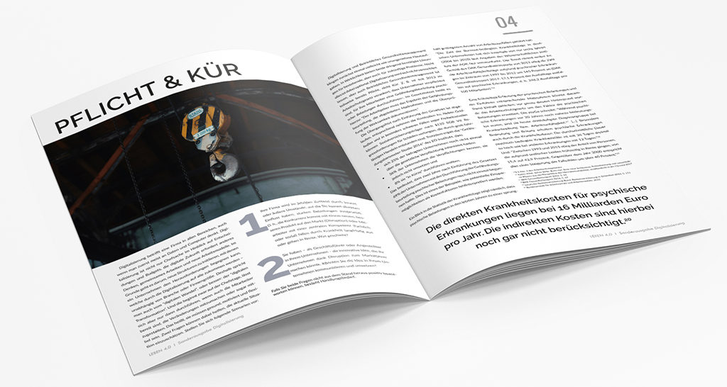
Aimed specifically at our target group of medium-sized enterprises, I created a magazine series with topics such as digitalization, innovation, and employer branding. These magazines featured my client’s main projects and selected cooperation partners from his network. The magazines were available for free – analog and digital – and distributed at fairs, during lectures, during the acquisition process, and online throughout the complete network. The concept of featuring different products of different providers made all of them have a personal interest to distribute the magazines.
Based on my research on performance/efficiency measures, with the magazines I laid out striking arguments for operational health management’s ROI and its benefits in terms of Employer Branding. Thus, I had created a groundwork of cooperation (I introduced the term “co-opetition”) to raise awareness on the side of the potential customers, but still, I didn’t have a USP for my client.
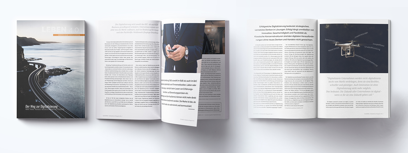
Here are the links to the magazines:
„UX is everywhere where humans are involved.“

UX in positioning and branding
User Experience or Customer Experience is not a new or exotic tool that lives somewhere in a niche. UX is elementary everywhere where humans are involved. And yes, that means: everywhere.
Over the years, I developed a process to guide my clients through the different aspects of positioning, branding – and finally product development based on UX (see chart on the left).
During each step, the human/customer point of view has to be considered. Or, the other way round, UX can contribute to each of these steps – a lot. UX can make a huge difference in terms of success, revenues and sustainability.
This client is one of the examples for radical rethinking. When I asked him the basic positioning question “What is your product?”, he answered “Me, of course”. That’s completely understandable from his perspective, especially being a trainer and speaker. But it’s a completely wrong approach when building a sellable product – it always has to take into consideration the customer’s needs and wants. Besides of luxury products, people buy things that solve their problems.
For this project, my client and I went through this process to understand and define his customer’s needs.
switching the perspective: user quotes and insights
I did have neither the time nor the budget for detailed customer interviews. Having been involved in the market for a while, I had a pretty clear understanding of the employee’s pain points concerning interviews and measurements concerning their mental state. But I wanted to make this personal and on point for my client to show him the “other side” of the interventions we had to think about when developing a product for him. So when I visited him at a congress, I collected quotes from employees whom I had asked one single question: “What do you feel about interventions that aim at evaluating mental wellbeing in your workplace?”
Here are the answers I selected to portray the situation from the employees‘ point of view. I didn’t create full-blown personas, but could refer to the quotes later on in the process.


USP according to customer’s needs
After having a clear picture of the employees’ needs, I proceeded to get a grip on the employer ones. To get hold of facts, I dove into more research.
I created a checklist and a website specifically aimed to gather data from potential customers. We invited 100+ companies of the target group to make a free check about how they would perform in terms of employer branding and health management. The online check as well as the click-through rate showed that the market my client originally was operating in (occupational safety) was pretty unpopular (only 17% of the visitors had clicked to see more information). But 98% wanted to learn more about the legal requirements.
My research pointed out the fact that, according to German law, every single company has to conduct a psychological risk assessment for all of its employees. Studies further demonstrated that 75 % of the smaller and middle-sized companies hadn’t made the assessment or even didn’t know that they were supposed to do one – there was the USPs resp. the hook.
making mental health measurable
A product that has to meet legal standards usually is not the most „sexy“ product – therefore, I wanted to add an additional benefit.
The legal requirements demand three steps:
1. Analyzing the situation of every employee
2. Performing a minimum standard measurement (mostly done with surveys that were known to be easy to outwit)
3. Evaluating and documenting the results (in consideration of specific data security/privacy regulations).
This isn’t especially popular with employees who don’t want their psychological situation evaluated, documented and reported to their company … as insiders mentioned stories about open revolts. That’s why we needed a fact-based, scientific and provable approach that at the same time delivered value to to employees (here the UX perspective was crucial).
I connected the client with one of my other projects and developed a risk point assessment for stress and resources, realized with a medical device. This could be the bridge between data and value resp. company and employees.
making mental health tangible

While the employers wanted hard facts, I made the concept not only about their employee’s data, but about their wellbeing and empowerment. Stress closely relates to health, but also to factors as relationships, resources, quality of life, sleep, positive emotions etc. The intervention (a scientifically backed breathing exercise) had enabled the participants to a huge change – all by themselves. They had received a lot of value in exchange for some anonymous data,
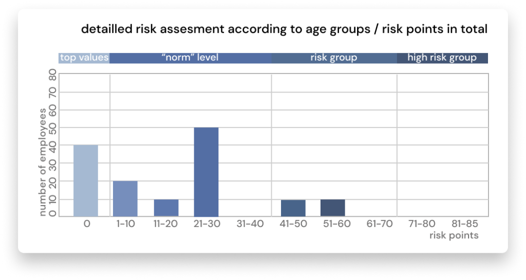
I designed a study, conducted 3 events with 103 test participants for a larger federal authority, and evaluated the data (see case study 1 for more details).
The companies got statistical results nicely displayed, but I made sure that the individual employee’s data was anonymized. The study showed the seriousness of our approach as well as positive benefits – the risk points were reduced by 15 points (= a reduction of about 67%) – within a 15-min intervention.
My client, as the safety expert in charge, used the study to display the method and the results and had another convincing marketing tool.

the Change Management Index
I had delivered and tested the product – an operational health management intervention. But I knew that there was a lot of additional data my team and I collected while spending days in the company and talking to employees, HR, and the management. Data is effective (and seductive) when visualized. We could use this for the acquisition of more jobs.
Based on a psychological model and test (the „limbic profile“), I developed a way to collect, analyze and visualize the additional (“soft”) data in the form of what I called „Change Management Index“. It consists of three basic pillars that reflected an overview of the company’s situation: Image/Growth, Stability/Safety, and Health/Development.
In the final meetings, I gave a presentation of our findings and explained them by means of the change management map. The clients were happy with getting a new point of view, hints on critical aspects, and resources they hadn’t been aware of.
And, yes, this strategy helped my client in upselling follow-up orders.
the website
After having built a tested product, I set up the client’s website, wrote user-friendly texts, and delivered an argumentation for health management measures – both in terms of legal requirements and ROI.

1 min explainer videos – making complexity short and fun

Since all topics around operational health management are extremly complex and often involve multiple players, it was important to find a way to present the key points in “digestible information chunks”. Since my client presents his offers primarily on fairs/congresses and through networking, I needed a tool that could deliver as well in small and big format.
I developed and produced a series of videos with both animation and text that explain the most important facts in 60-90 seconds. These videos could deliver not just in small (presenting on an iPad), but also in big formats (LED display stands).
product packages and pricing
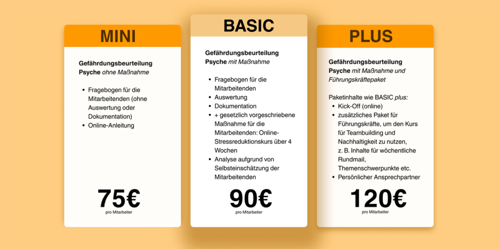
In my experience, clients have a hard time to define their products and prices. Therefore, this step is always included in my positioning and business strategy approach. Market analysis, KPIs and a profound knowledge of my client’s projects came together for a data based proposal.
The product packages are aimed at making the basic product – technically my client’s main product – appear to be the best choice.
The packages change and evolve with the client’s business.
the sustainability test four years later
In the spring of 2022, after two years of COVID-19 and lots of changes in his business segment, the client and I re-evaluated the situation and his positioning. Despite all changes, as well the USPs., the website texts and the website still completely fit his business plans and marketing strategy. We just needed to update the figures/data for the ROI calculation.
challenges, obstacles and considerations
My client works in a fast-paced environment with (before COVID) on average two fairs or congresses a week, which meant lots of input and new ideas all throughout the project. We had a bit of a learning curve in the beginning until we adopted a working style where my task was to keep an eye (or two) on the business strategy and filter the helpful bits from the „information noise“. In other words: He did lots of uncoordinated “user tests” with every new step or tool I created out there in the wild, but in the end, we could use the flood of incoming data for amending the processes and deliverables. Usually, I would prefer lab-style user tests and evaluations, but considering the timeframe and budget of the project, our “Wild West” style of user testing was quite helpful and handy and led to fast iterations and progress.


